Last Updated on January 29, 2025 by andrewshih
Have you ever been overwhelmed by too many problems and not known where to start?
Imagine if you could identify the few key issues that, once fixed, would solve most of your challenges. This is where the Pareto Chart comes in.
In this blog post, we’ll explore how Pareto Charts use the 80/20 Rule to help you identify and prioritize the most important problems. Whether you’re in quality management, customer service, project management, or any field where efficiency matters, learning to use Pareto Charts can make a big difference. Let’s see how this tool can help you focus your efforts and achieve great results.
What is a Pareto Chart?
A Pareto Chart is a graphical representation that highlights the most critical factors among a set of factors. It typically shows bars in descending order of frequency or impact, with a cumulative percentage line that helps identify the most significant issues.
The Pareto 80/20 Principle
The 80/20 Principle, also known as the Pareto Principle, states that a small number of causes (20%) are responsible for a large percentage (80%) of the effect. In quality management, this means a few key issues are often responsible for the majority of problems in a process.
The Purpose of a Pareto Chart
The primary purpose of a Pareto Chart is to identify the “vital few” causes that contribute most significantly to a problem, in line with the Pareto Principle, which states that 80% of problems are often due to 20% of the causes. This helps organizations allocate resources effectively to address the most impactful issues first, leading to significant improvements in quality and efficiency.
While the Pareto Chart emphasizes the “vital few,” it also highlights the “trivial many” – the remaining causes contributing to 20% of the problems. Although these causes individually have a smaller impact, collectively they can still be significant. Understanding the “trivial many” ensures that no potential problem areas are overlooked.
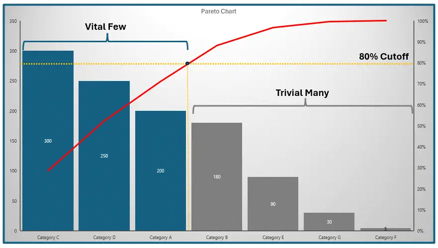
By identifying both the “vital few” and the “trivial many,” Pareto Charts enable a comprehensive approach to problem-solving. Teams can prioritize critical issues while remaining aware of minor ones, addressing them over time. This balanced approach ensures thorough and effective resolution, leading to sustained improvements and optimal performance.
Basic Components of a Pareto Chart
- Vertical and Horizontal Axes: The vertical axis on the left shows the frequency of occurrences, while the horizontal axis lists the causes or categories.
- Bars: The bars represent the frequency of each cause, arranged in descending order from left to right.
- Line Graph: A cumulative line graph plots the cumulative percentage of occurrences, helping to visualize the cumulative impact of the causes.
When to Use a Pareto Chart
Pareto Chart is particularly useful for:
- Problem Identification: To identify the most significant problems affecting a process.
- Prioritization: To prioritize issues that need immediate attention.
- Root Cause Analysis: To focus on the most frequent causes of defects.
- Quality Improvement: To improve processes by addressing the most critical factors.
Additionally, Pareto Charts serve various business purposes, including:
- Quality Control and Improvement: To identify and address the most common defects or errors in manufacturing and healthcare.
- Customer Service: To enhance customer satisfaction by focusing on primary sources of complaints in the service industry and retail.
- Project Management: For resolving key issues and optimizing processes to improve project outcomes.
- Process Improvement: Within Lean Six Sigma and business processes to tackle the major causes of waste or inefficiency.
- Data Analysis and Reporting: To highlight the most frequent responses or incidents, guiding targeted interventions.
By utilizing Pareto Charts, organizations can effectively identify, prioritize, and address key issues across various domains, leading to improved performance and efficiency.
Benefits of Using Pareto Charts
-
Clarity and Simplicity: Provide a clear visual representation of data, making it easy to identify the most significant problems at a glance.
-
Effective Prioritization: Highlight the most frequent or impactful problems, allowing for efficient resource allocation to address the most critical issues first.
-
Data-Driven Decision Making: Ensure decisions are based on actual data, leading to more accurate and reliable outcomes.
-
Enhanced Focus and Efficiency: Direct attention and efforts towards the most significant causes, resulting in faster and more efficient problem-solving.
-
Continuous Improvement: Facilitate ongoing monitoring and iterative improvements, fostering a culture of continuous enhancement.
-
Communication and Collaboration: Provide a clear and common understanding of major issues, improving communication and engaging stakeholders in the problem-solving process.
Advantages and Disadvantages
Advantages:
-
Simplicity: Easy to understand and interpret.
-
Prioritization: Helps focus on the most critical issues.
-
Visualization: Provides a clear visual representation of data.
Disadvantages:
-
Limited Scope: May not identify all causes of a problem.
-
Static Data: Represents a snapshot in time and may need updates.
Steps to Create a Pareto Chart
- Collect Data: Gather data on the factors affecting the process.
- Categorize Data: Group the data into categories.
- Calculate Frequency: Determine the frequency or impact of each category.
- Sort Data: Arrange the categories in descending order of frequency.
- Create Bar Graph: Plot the bars for each category.
- Add Cumulative Line: Plot the cumulative percentage line.
Pareto Chart Example
Example: Problem Identification in Car Manufacturing
Let’s walk through an example and create a Pareto chart together. Consider a car manufacturing process where various defects are causing issues. The goal is to identify the most significant defects to prioritize improvements.
Step #1: Collect Data: Record the number of defects for each type over a month.
During the data collection stage, we will record any identified defect for a predetermined duration. The identification can be a brief or concise description of the issues. For example:
- Contact with sharp tools
- Forklift mishandling
- Uneven paint application
- Faulty alignment tools
- Excessive force during assembly
- Thermal expansion and contraction
- Inconsistent torque application
- Improper curing process
- Collision with other components
- Poor packaging during transportation
Step #2: Categorize Data: Group defects into categories.
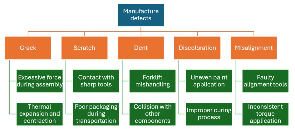
Using the affinity diagram technique is an effective method of categorizing the issues.
From this exercise, the team identified Scratch, Dent, Discoloration, Misalignment, and Crack as the main defect categories.
Step #3: Calculate Frequency: Determine the frequency of each defect type.
Aggregated the defect frequency based on the defect categories defined.
| Defect Category | Frequency |
|---|---|
| Crack | 10 |
| Dent | 30 |
| Scratch | 50 |
| Discoloration | 20 |
| Misalignment | 15 |
Step #4: Sort Data: Arrange categories in descending order
Next, rearrange the rows from the largest to the smallest value.
| Defect Category | Frequency |
|---|---|
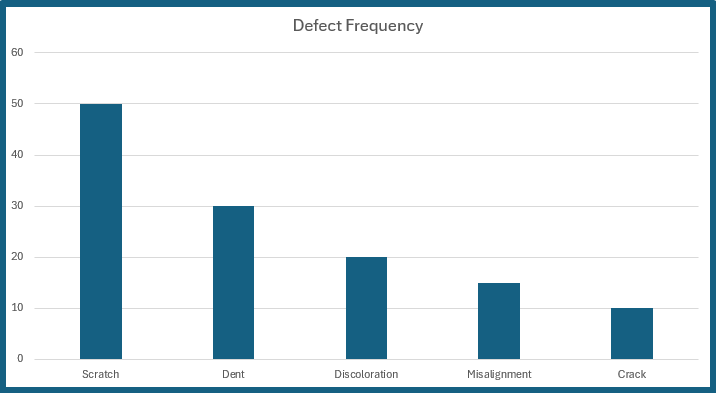
| Scratch | 50 |
| Dent | 30 |
| Discoloration | 20 |
| Misalignment | 15 |
| Crack | 10 |
Step #5: Create Bar Graph: Plot the bars for each defect type.
Step #6: Add Cumulative Line
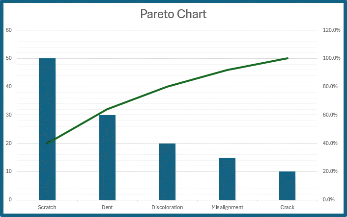
| Defect Category | Frequency | Frequency % | Accumulative % |
|---|---|---|---|
| Scratch | 50 | 40% | 40% |
| Dent | 30 | 24% | 64% |
| Discoloration | 20 | 16% | 80% |
| Misalignment | 15 | 12% | 92% |
| Crack | 10 | 8% | 100% |
Create Pareto Charts in Excel
There are several ways to make a Pareto chart in Excel. The easiest way to use the built-in Pareto chart feature.
The first step is to gather and categorize the data, and then count the frequency. With the build-in Excel Pareto Chart, you do not even have to sort the data from highest to lowest frequency.
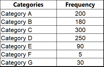
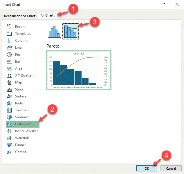
Next, Open Insert Chart.
- Go to All Charts
- Navigate to Histogram
- Pick Pareto from the list of Histograms
- Click OK
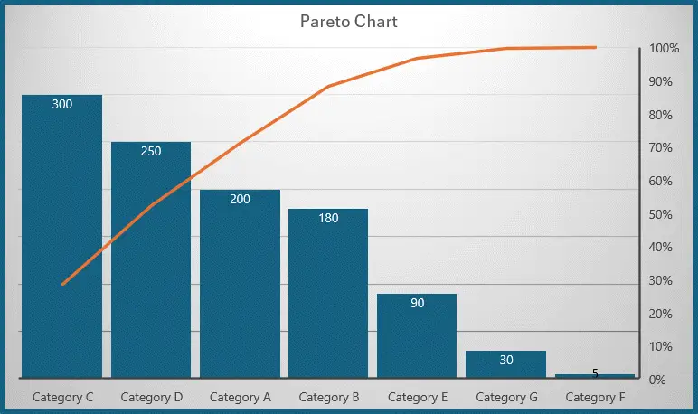
Once you create the Pareto Chart, you can adjust the chart styles as needed.
Conclusion
A Pareto Chart is an essential tool in project management for identifying and prioritizing the most significant issues. By focusing on the most critical factors, project managers can allocate resources more effectively and improve overall process quality.
FAQ
What is the origin of the Pareto Chart?
The Pareto Chart is named after Vilfredo Pareto, an Italian economist who observed that 80% of Italy’s wealth was owned by 20% of the population. This observation led to the development of the Pareto Principle, also known as the 80/20 Rule, which underpins the use of Pareto Charts in various fields.
How does a Pareto Chart differ from other bar charts?
A Pareto Chart differs from a regular bar chart in that it specifically orders the bars from largest to smallest frequency or impact and includes a cumulative percentage line. This combination provides a clear visual representation of both the individual and cumulative contributions of each category, which is not typically the focus of standard bar charts.
How does a Pareto Chart help in decision-making?
A Pareto Chart helps in decision-making by visually representing data in a way that highlights the most significant issues. By focusing on the “vital few” causes that have the largest impact, decision-makers can prioritize their actions and allocate resources more effectively.
Can a Pareto Chart be used for non-quality-related issues?
Yes, a Pareto Chart can be used for various types of analysis beyond quality-related issues. It is useful in customer service to identify common complaints, in project management to prioritize tasks, and in any other field where identifying and addressing the most significant factors can lead to improvements.
What types of data are best suited for a Pareto Chart?
Pareto Charts are best suited for categorical data where frequencies or impacts of different categories can be measured. This includes data on defects, complaints, errors, or any other factors that can be categorized and counted.
How often should a Pareto Chart be updated?
The frequency of updating a Pareto Chart depends on the context in which it is used. For ongoing processes, it should be updated regularly, such as monthly or quarterly, to reflect the most current data. For project-based or one-time analyses, it should be updated as new data becomes available.
Can Pareto Charts be used in conjunction with other analytical tools?
Yes, Pareto Charts are often used alongside other analytical tools like Fishbone Diagrams, control charts, and root cause analysis tools. Combining these tools can provide a more comprehensive understanding of the issues and facilitate more effective problem-solving.
What are some common pitfalls to avoid when using Pareto Charts?
Common pitfalls include:
- Collecting inaccurate or incomplete data
- Misinterpreting the cumulative line graph
- Ignoring minor but collectively significant issues
- Failing to update the chart regularly.
Ensuring accurate data collection, proper training, and regular updates can help avoid these issues.
How can technology aid in creating Pareto Charts?
Technology can significantly aid in creating Pareto Charts. Software like Microsoft Excel, Google Sheets, and specialized tools like Minitab or JMP provide templates and automated features that simplify the creation and updating of Pareto Charts. These tools can handle large datasets and offer customization options for more detailed analysis.
Are Pareto Charts applicable in small-scale operations?
Yes, Pareto Charts are applicable in small-scale operations as well as large ones. Even small businesses can benefit from identifying and addressing their most significant issues. The principles of focusing on the most impactful problems and prioritizing resources apply universally, regardless of the scale of the operation.


